Introduction
Gothenburg, in Sweden, offers a transportation system where you can rent bikes at several places around the city. This system is called “Styr & Ställ”. This large bike rental system has unfortunately made many people frustrated and annoyed during the years, since its very hard du understand and use. When we had the course "Usability, tools and methods" we got the opportunity to pick a product or system to evaluate and re-design from a usability perspective. And of course we wanted to work with the system of Styr&Ställ!
Theoretical evaluation
The goal was to find the user errors and usability issues that arises in the interaction with the software of the “Styr & Ställ” system. We performed a theoretical evaluation with tools like Cognitive Walkthrough and Predictive Human Error Analysis.
Preparations for empirical evaluation
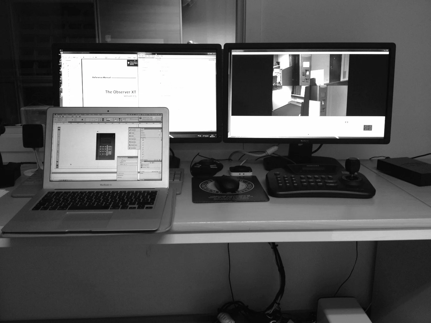
To perform an empirical evaluation on existing products, we created a product repesentation of the rental automat. The actual product can be seen to the left and our prototype to the right. The prototype were build with a foundation of wood, covered in spray painted capa-board and two built in screens. The interactive software were created in InDesign and Illustrator.

To be able to conduct the evaluation we conducted some research about the users and the tasks that were used the most and considered as the most important. This was done partly by talking to the company behind the product and also through observations and interviews with users.
As a part of the preparations for the usability tests a group of test subjects, that could represent the actual group of users, were recruited. And the usability test were planned in detail. The goal was to measure usability factors as in which extent the users performed the tasks with effectiveness, efficiency and satisfaction.

Usability test 1
The tests were conducted in a lab environment and included 8 test persons. They all got scenario based tasks, and in internally varied order they performed the 4 most common and important tasks with our prototype of the current system. All tests were recorded with video and audio, started out with a short introduction and were finished with a semi structured interview and a survey.
Analysis and Re-design
When the tests were finished they were all transcribed and analysed. Through a KJ-analysis the problems were identified and sorted. Based on the found problems and recognised design principles we started to re-desig the systems software through a new information architecture, layout re-arrangements and a re-design of the visual elements. When the new system was re-designed and finished it was time to test it.

The software was re-designed with the goal to improve the internal coherency, feedback and information hierarchy. That was conducted through an increased visual clarity and by a re-prioritisation of the information. We also removed som faulty affordances and added information about where in the system the user currently are, through tabs.
Usability test 2
To find out if our re-designed interface had improved conditions for good usability a new representative user group were recruited. We prepared the lab identically with our first usability test and conducted the test in the exactly same manner as before. The reason behind keeping the tests as identical as possiblewas to be able to compare the measurements and collected data, to actually see if the re-designed system could be used better in terms of effectiveness, efficiency and satisfaction.

Result
In our re-designed interface we managed, not only to make the amount of needed interactions to perform all tasks fewer, we also managed to decrease the time it took for a typical user to perform the tasks. The total average time it took to perform the tasks were decreased from 6 minutes and 17 seconds to 3 minutes and 45 seconds with the re-designed system. The average of faulty interactions were decreased by half, from an average of 18 to 9, with the new design. We also evaluated subjective data from the surveys and interviews that clearly showed that our re-designed product created more positive reactions than the original product.
With out re-designed system we managed to decrease the faulty interactions with 50 % and the total average time with almost 50 %!